Colour scratchboard illustration commissioned recently for a Letterpress Project publication cover commemorating the death of Jane Slowey CBE who had been a founding member of the Letterpress Project. Throughout her life she had been a dedicated reader and believed strongly in the transformative power of books. The brief was to depict a young girl reading, the illustration capturing that moment of inspiration brought about by books.

specialist or multi-style illustrator?
www.bullockillustration.com
Which way do you jump when you need an illustration to enhance that all new important project you are working on; hire an Illustrator specialising in one style only or one who works in a variety of styles?
I know Illustrators from both camps and both approaches has it’s pros and cons.
Being long-in-the-tooth scribbling with my crayons I just won’t specialise. Working in a range of styles keeps me passionate about doing what I do and I enjoy the flexibility this approach offers my clients, treating each and every project as an individual challenge, regardless of the size of the job.

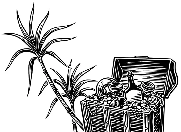
Peg Leg Pete spiced rum label illustrations
Yo ho ho and a bottle of…


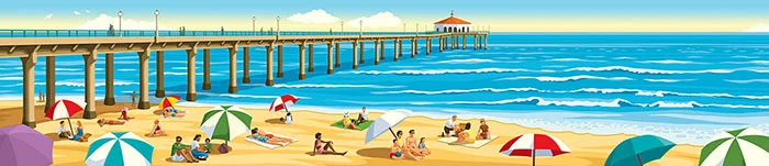
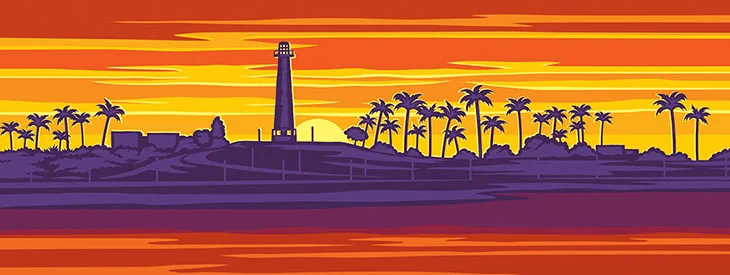
Manhattan Beach vector illustrations
I was commissioned a while ago by The Formation Creative Consultants Europe Ltd to do a series of illustrations for ‘Mother’s Market & Kitchen’, a new flagship natural food store in Signal Hill, California.
Recently I was asked to do a few new illustrations for another of their stores at Manhattan Beach, California depicting Manhattan Beach over the decades. As per the previous illustrations, because they are vector-based the images were blown up to enormous sizes for large billboards and main picture windows.


Wine label
Just hit Sainsbury’s stores; Sullivan’s Creek Merlot Aussie wine with this mug shot of the fictional character.

Crisps illustration
Amarillo Chilli & Lime. The latest in a range of illustrations for Tayto Hand Cooked Potato Crisps.


Llama Tuesday!
It’s Llama Tuesday!…and why not on a sunny day? Latest in a series of Artfoil cuties for kids to scape away at their hearts content.

JUST THE TONIC!
This little gem has just arrived in the post from a very kind and valued client to show his appreciation of my Illustrative input. Originally he’d sent me a bottle for Christmas but the Postman must have enjoyed it as it mysteriously disappeared en route and so another bottle was sent. I must say, it’s a very appreciated tonic on a grey and cold wintery day!


That takes the biscuit!
Recent illustrations for Deluxe savoury biscuits now on shelves at Lidl. Bit of cheese with that?

Mythical creatures travel posters
Mythical creatures travel posters; a recent fun project for Go Compare to create a series of retro-inspired travel poster images imagining what advertising would be like if travellers could take a tour to visit the worlds most unusual mythical creatures.
Links;
http://www.gocompare.com/travel-insurance/country-folklore/
https://www.lonelyplanet.com/news/gallery/2018/03/30/mythical-folklore-travel-posters/


Landscape illustrations
California dreaming; I was commissioned a short while ago by The Formation Creative Consultants Europe Ltd to do a series of illustrations for ‘Mother’s Market & Kitchen’, a new flagship natural food store in Signal Hill, California. The brief was to produce a series of large landscape illustrations depicting different aspects of the Signal Hill area including it’s historic past and it’s modern organic food production. Being vector based, the illustrations were able to be blown up to the enormous sizes needed for the large billboards and main picture window. I wish I was able to have been over there in the sunshine state for the opening night which apparently went down very well. Job done!


Lidl liqueurs

Late last year I was commissioned to produce some illustrations for a Deluxe range of liqueurs for Lidl. It was one of my favourite jobs to work on last year and I was pleased to buy a few bottles when they appeared on the shelves in Nov. They went down well over the Christmas break!


Cheesy 50's toothpaste ad
I was commissioned recently to create a 50's toothpaste ad pastiche illustration for a direct mail campaign. Retro yet colourful and modern plus plenty of cheesiness thrown in!
BA facebook ad
Illustrations produced recently for a British Airways Facebook ad to promote florida fly-drive holidays. They wanted a retro travel poster feel with lots of bright colour- www.facebook.com/76903425829/posts/10156045434450830

Crisps!
Part of a range of Illustrations commissioned for 'Tayto' crisps in Ireland. I'm still awaiting the promised samples the client said they'd send!


Touching Base!


I was recently commissioned by Penguin Books in NY to do a series of illustrations for a book about the the history of the Chicago Cubs. Despite being a Brit and not knowing a lot about baseball it turned out to be a very satisfying project to work on.
I was recently commissioned by a U.S. distillery to produce an image of the head of an American Bald Eagle for one of their spirit labels. The distillery is owned and run by ex military and wanted the image to be 'bad-ass' (their words). I didn't want to disappoint them!
Kawaii scraper-board illustrations
Been doing a series of ‘Kawaii’ scraperboard illustrations for a French company. These will be part of a range of Artfoil illustrations for sale in craft shops. Kid’s will hopefully enjoy scraping away at these little cuties. A bit different to the illustrations I usually do but variety is the spice of life!


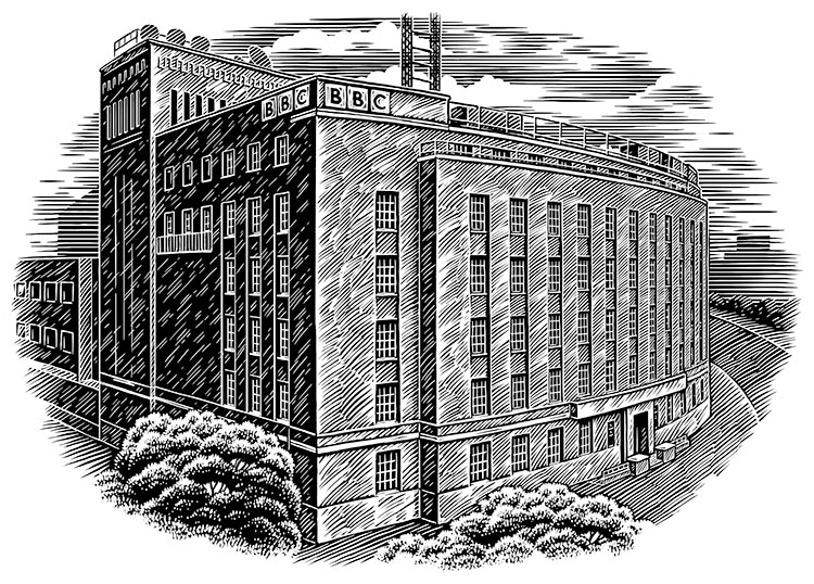
BBC scraper-board
I was recently commissioned by the BBC (name drop!) to produce an illustration of Broadcasting House, Belfast. The 1930’s building is modelled on the BBC's London HQ and has a distinctive curved façade’. The BBC are very proud of their iconic building and decided to approach me to produce one of my traditional scraper-board illustrations to be used for postcards and corporate gifts for visitors that describe the history of their building and its 21st century work.
Mary Rose illustration work

The Mary Rose museum in Portsmouth has re-opened today. After many decades in a sealed area within the museum treating the timbers with preserving chemicals as they slowly dried out, the existing ship timbers can now be seen for the first time 'in the raw' without a glass barrier. Very exciting time for those of us who've worked on the project, albeit it in a small way personally, having produced a series of illustrations for the museum.